
TRIPPY
TRIPPY
In this project, myself and a team of four others designed a mobile app called Trippy to help users simplify travel preparation and reduce travel-related stresses to support a smooth, enjoyable, and worry-free travel experience.
UX/UI BOOTCAMP UNIVERSITY OF MINNESOTA
Project Overview
Role: UX Design, UX Research, Prototyping.
Timeline: 4 weeks.
Tools: Figma, FigJam, Google Suite.
Problem
How might we simplify travel preparation and reduce travel-related stresses for families looking to make the most of their trips in order to support a smooth, enjoyable, and worry-free travel experience?
Action
Our team designed a mobile app with an AI powered user-tailored list generator that will help users feel organized and secure for their upcoming trips. We wanted them to be able to generate lists (ex. packing lists), keep loved ones updated on itinerary, and plan their schedule all in one place.
The Process
User Research, Ideation & Brainstorming, Wireframing, Testing & Iterating, High Fidelity Prototype, and Future Iterations.
1. User Research
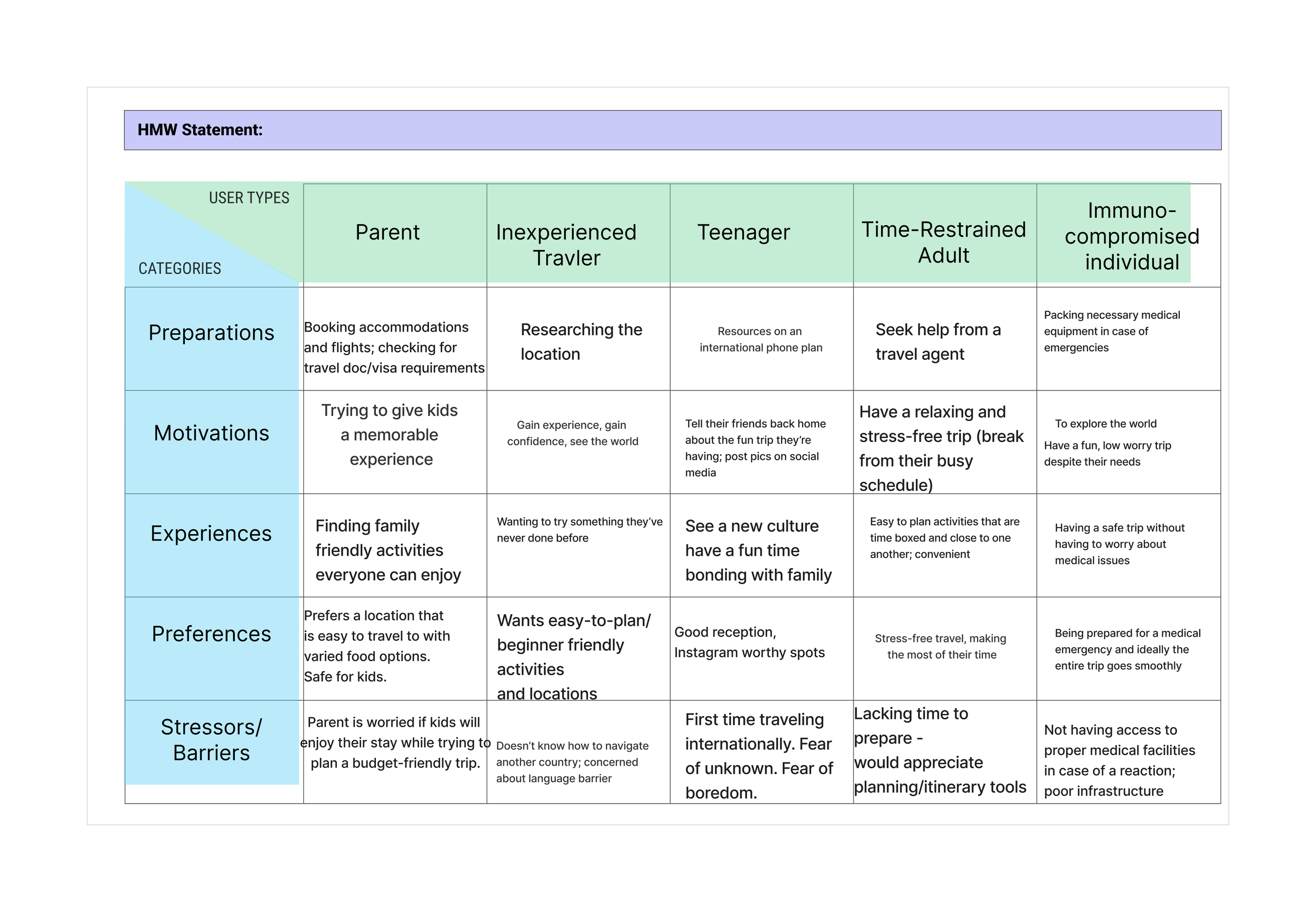
Behavioral Archetypes
Once our team had brainstormed and gone through dot voting, we decided to focus on solving problems related to international traveling. At this stage, we felt pulled to issues such as safety, planning a trip in an unknown area, budgeting, etc. After workshopping some bare boned proto personas, we created two behavioral archetypes.
User Research Planning
To structure our research, we created a research plan and discussion guide. We chose to conduct five in depth interviews to get our qualitative date, and send out a Google survey to get our quantitative data. We created the following research plan:
Research Plan
Background:
Traveling can be an extremely joyful but also stressful experience. We believe providing access to important planning and safety resources for travelers will help them achieve a safe, comfortable and more memorable experience.
Research Objectives:
What concerns do people have while traveling?
What prevents people from traveling internationally/solo?
What helps people feel safe while traveling/what would help?
What kind of resources do people find the most helpful when traveling?
Where do people found out more info about where they're traveling? How do people research?
Research Methods:
We plan to interview people who have traveled as well as people with an interest in travel in order to learn more about the challenges/resources people use for traveling. Additionally, we will conduct a survey via Google Forms to reach more participants.
Participants:
We will have a sample size of five. Participants will span a wide range of demographics. The key is that each participant has an interest in travel.
Discussion Guide:
Our interview questions focused on general demographics of the user, their pre-travel habits, their motivations to travel, and their travel experience.
Ann Marie —
“I like to get an idea of what crime rates are. There are some cities where pickpocketing is really prevalent, and there's other cities where things are more safe, so I think having an idea of what crime is like, especially at train stations or in the subway, is really helpful and makes you feel more confident.”
Ann Marie —
“I don't like to feel pushed when I'm traveling. I like to take things slow in one area and I think really kind of prioritizing your rest and taking care of yourself helps you enjoy the trip more. ”
Interview Highlights
After conducting our interviews, we first analyzed our qualitative data. To do so, we shared highlights from the transcripts of each of our interviews. Some highlights from my interview included…
Survey Highlights
Next, we analyzed our quantitative data from our survey. In our survey, we asked questions that would give us a better understanding of users’ travel habits, fears, and needs. Some highlights include…

What safety measures do you take before traveling to a foreign country?
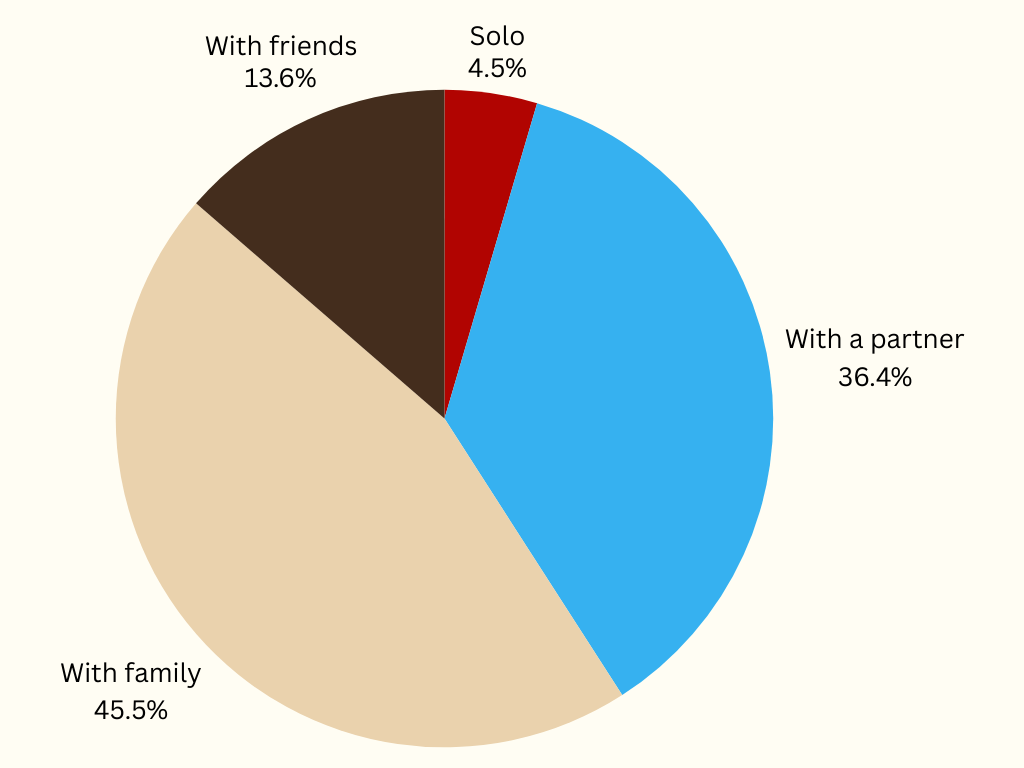
Who do you prefer to travel with?
Through our survey, we found that one of the biggest things our users do to feel safe on trips is share their travel plans with friends and family. We also found that almost all of our users prefered to travel with family or a partner instead of by themselves. Overall, we concluded that travelers depend on their loved ones and family members not only for planning, but also for feeling safe while they’re abroad.
Affinity Mapping
We compiled all of the important data we received from our interviews and survey into an affinity map. Some of our key takeaways included:
People travel in order to broaden their horizons by experiencing new cultures.
Preparation is essential for travel in order for travelers to have peace of mind.
After writing everything down, we grouped our data into six total themes. Three themes we chose to focus on throughout the rest of our project included Experience, Stressors, and Preparations.
How Might We & User Insight Statements
How might we simplify travel preparation and reduce travel-related stresses for families looking to make the most of their trips in order to support a smooth, enjoyable, and worry-free travel experience?
A parent traveling with their kids needs to identify local attractions and experiences because of their desire to ensure their children have an enjoyable and formative trip where they discover a new culture and broaden their horizons.
We believe providing a mobile app with an AI powered user-tailored list generator for families with limited planning time and experience will help prepare families for trips and create a stress free trip preparing experience to enable a space to create positive memories.
Competitive Analysis
To gather more information, we completed a competitive analysis of apps that filled needs similar to the ones discussed by our users, such as safety, navigation, and planning. These apps included Hoodmaps, Expedia, Google Maps, Trip Advisor, and Citizen. After looking at these competitors, we decided we wanted our app to focus on preparing users for travel without inciting fear or worry. To view our analysis…
2. Ideation and Brainstorming
Creative Matrix
After gathering all of our user data, our next step was to move into our ideation and brainstorming phase. We began with a creative matrix, where we brainstormed potential user types and some actions and emotions they might have before a trip that fit within the categories we had previously established in our affinity mapping. We did this while keeping in mind our main goal: ensuring that all users feel comfortable and at ease before and during their trip.
Priority Matrix
Next, we determined all of our aspirations for our app through an I like, I wish, I wonder diagram. To view this diagram, click here. We took these ideas and organized them in a priority matrix. Through this diagram, we determined that it was the most feasible and highest priority for us to focus on features that centered preparation, convenience, and communication.

User Journey Map
Now that we knew who our user was and our purpose for the app, we created our user journey map. We decided to center it on User B from our behavioral archetype, as uncertain family travelers had turned out to be our main audience in our research, and determined where and how our app could fit in and enhance his travel plans. A key highlight that came out of this step was the emphasis on list generation and the presence of a shareable itinerary.
User Flows
The last step we had to accomplish before moving into our prototyping was creating our user flow. I took a leading role in this step. While we created other simple flows, such as a log in flow, that can be viewed here, our main flow flows, the trip profile creation flow and the generate list flow, focused on the initial tasks we wanted our user to accomplish with our app to simplify their travel experience.


3. Wireframing
Low Fidelity
As we began wireframing, we determined that we would be able to get the most out of our time if we all created our own individual low fidelity prototype. This proved to be essential, as we were able to come together and pick the best ideas from each set of frames, ensuring that everyone’s voice was heard and we had a large pool of concepts to draw from as we moved forward in our app creation process. Below are excerpts from my personal low fidelity wireframes, which may be viewed in Figma. I focused on creating a hub where users would be able to view all of their existing trips, as well as smooth processes for them to add new trips and generate helpful lists.


Mid Fidelity
Next, we came together and reviewed our individual prototypes. Because we had established such a thorough user flow, we found that we were mostly in agreement over the general design of our app. Some of the things that moved forward to this stage from my specific prototype were the login flow and the trips homepage. To view our full mid fidelity prototype, click here.


3. Testing
Accessibility Testing
Before going ahead with our usability testing, we made sure that all colors we used passed APCA guidelines to make sure our app was accessible for all users.
Usability Testing Plan
We developed the following six-step user testing plan, which contained the following tasks:
Task 1: The user signs up by creating an account.
Task 2: The new user is able to add a new trip.
Task 3: The new user is able to add a new list.
Task 4: The “returning user” is able to view a previously added list.
Task 5: The “returning user” creates a new packing list in their previously existing trip.
Task 6: The “returning user” creates a new trip in their account.
To view the plan in more detail, along with my personal notes, click here. We carried out our testing with a total of five users.
Usability Testing Results
From our testing, we found that our users…
Liked the use of icons, and would appreciate having even more.
Appreciated the layout of the home page w/ hamburger menu.
More specifically, users liked being able to create a new trip directly from the home page.
Would like to have more ways to customize their trip – adding itineraries, hotel information, nicknaming the trip, etc.
Would enjoy having a “resources” feature later on that could help them plan even more aspects of their trip right in the app.
Felt bottom bar could be sticky. User found it a little confusing to have to scroll all the way to the bottom to find the back arrow.
4. High Fidelity Iteration
With the conclusion of the group portion of this project, I have begun working on a high fidelity version of this mobile app concept. To view this high fidelity prototype, click here. To begin this portion of my work, I’ve focused on developing the brand identity of the app, as well as refining some of the prototyping.


5. Future Steps
As I continue to develop this prototype, my main goal is to add more features, especially a sharing feature. This was one of the most compelling feature ideas to our users when we conducted our research. While we were not able to flesh this out within the constraints of the initial project, I will be adding this to my personal prototype to explore the possibilities of Trippy.