
SEASIDE SUSTAINABILITY
SEASIDE SUSTAINABILITY
Seaside Sustainability is a nonprofit organization based out of Gloucester, MA. They aim to empower and educate communities – their own and those across the world – in order to promote sustainability, specifically that of water-based ecosystems. In this responsive redesign project, our overall goal was to make Seaside Sustainability’s website more clear for users. We planned to do this by improving their information architecture.
UX/UI BOOTCAMP UNIVERSITY OF MINNESOTA
Project Overview
Role: UX Design, UX Research, Prototyping.
Timeline: 4 weeks.
Tools: Figma, FigJam, Google Suite.
Problem
After analyzing Seaside Sustainability’s website, we determined that users who want to be able to easily navigate the site in order to support their mission through volunteer work and donations are struggling to understand how they can get involved because the site is difficult to navigate.
Action
By organizing the information architecture on Seaside Sustainability’s website in a clearer and more concise way for those looking to volunteer or donate to the organization, we will help more people be able to support their mission.
The Process
Content Analysis, User Research, Brand Identity, Prototyping, A/B Testing, High Fidelity, Future Iterations.
Site Background
Seaside Sustainability is a nonprofit organization based out of Gloucester, Massachusetts. They aim to empower and educate communities – their own and those across the world – in order to promote sustainability, specifically that of water-based ecosystems.
In this project, our overall goal was to make Seaside Sustainability’s website more clear for users. We planned to do this by improving their information architecture. While they have a large amount of quality content, it is not organized clearly, which may confuse users and even turn them away. We wanted to make this nonprofit’s mission clear and exciting for all potential visitors of the site.
One section we particularly wanted to improve is the nav bar, shown above. It currently is split into three sections – the search bar, the logo/shop/make a gift, and four drop downs. We wanted to condense this information and highlight the pages users are most likely searching for.
1. User Research
Problem Statements
User Problem Statement: As a middle-aged marketing professional living near the ocean, I want to be able to easily navigate Seaside Sustainability’s website so that I can support their mission through volunteer work and donations. But I struggle to understand how I can help their mission because I can’t understand how to navigate their website.
We believe organizing the information architecture on Seaside Sustainability’s website in a clearer and more concise way for those looking to volunteer or donate to the organization will help more people be able to support their mission.

User Journey Map
Next, I developed a user journey map to brainstorm more ideas about who our potential user is and what they’re looking to get out of our website.

Diverge/Converge
Next, we individually brainstormed ideas to help our user meet their goals. When we came together, we talked through our ideas, especially focusing on the feasibility and urgency of each solution. We decided that for the scope of this redesign, we would need to condense and streamline the nav bar, clean up and reorganize the homepage, and make it clear and easy how users can donate or volunteer.
2. Content Analysis
Current Content Hierarchy
Next, we evaluated Seaside Sustainability’s current content hierarchy and conducted an audit. To begin our evaluation we first asked ourselves, how easy is it to identify the most important information on the homepage at a glance?
We would rank the ease of finding information as mediocre. The key detrimental element to this score is the organization’s choice to include a large video right at the top of the page. While the video states important information, such as the organization’s goals, and may be preferred by some users, it’s important to have the message reiterated in text close by, which it is not.
ON MOBILE: The navigation bar tabs (ex. Who we are, what we do) are non existent.
Does the current site use any of the three strategies (color and contrast, scale, or grouping) more or less effectively than the others?
Color and Contrast – this strategy is used the best. The one area for improvement would maybe be text – this may be a little to thin in some areas.
Scale – the scale of the logo is off – it’s very small on desktop, and does not have a clear purpose. The scale of the video is also much too large.
Grouping – this is used maybe the least effectively. The navigation bar feels very clunky and difficult to read. Further down the home page, this used better.
We Recommend:
Cleaning up the nav bar.
Grouping drop down elements in more effective/relevant categories.
Below is a visual with an example of some of our findings.


Current Content Inventory and Audit
After we evaluated the current content hierarchy, I took inventory of every item on the pages we were redesigning and conducted an audit. I focused most of my work on the nav bar. To view my inventory and audit…
IA Analysis and Navigation
Because the information architecture was the main thing we wanted to improve on Seaside Sustainability’s site, we analyzed this aspect in special detail. We focused mainly on the confusing nature of the nav bar dropdowns and the unstructured nature of the nav bar as a whole. For our improved site, we decided to organize the dropdowns, create one distinct navigation bar from the multiple levels that currently existed, shift the placement of the logo, implement a consistently appearing hamburger menu on mobile, and move the placement of the video.
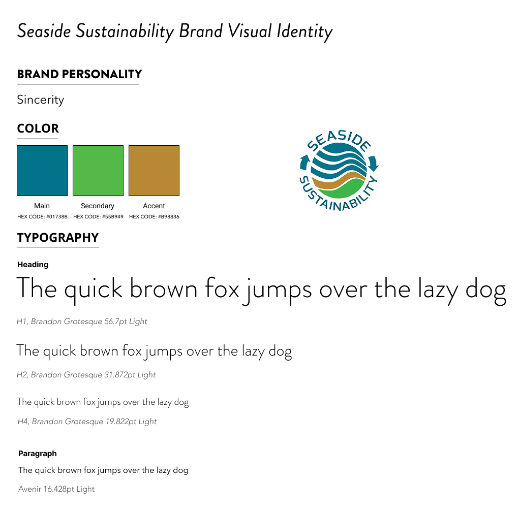
3. Brand Identity
Brand Visual Identity Guide
For the scope of this project, we stayed true to the colors and fonts already used by Seaside Sustainability. The nature-focused colors (blue, green, and tan) show the organization’s connection to the environment, while the simple font evokes sincerity and simplicity that users can feel welcomed by.
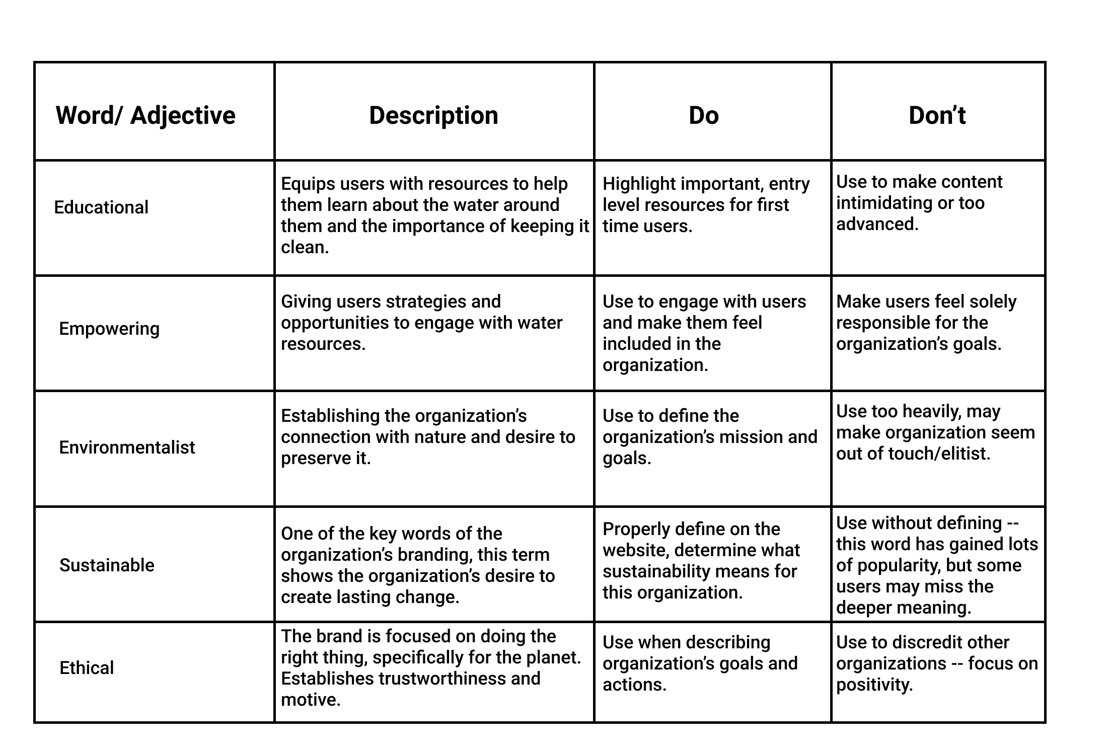
Brand Voice Guide
To continue developing the organization’s character, I completed a brand voice guide. This guide will shape all copy moving forward. In summary, Seaside Sustainability should act as a welcoming and educational resource for those looking to get involved in the climate crisis. Copy should focus on empowering the user, especially emphasizing their ability to actually make an impact with the organization’s help.

4. Prototyping
Low Fidelity Wireframes
We then moved into our low fidelity wireframes. In my wireframes, I focused a lot on the design concept of hierarchy — for example, I moved the mission statement to the top of the page as it is crucial information Seaside Sustainability wants their users to read, but was previously hidden under less important content. Some other key things I included in these wireframes were more organized drop downs on both mobile and desktop, a mission statement at the top of the page, and an accordion to condense content. As this is a responsive redesign, I completed both mobile and desktop wireframes.


Mid Fidelity Pattern Library
As I prototyped, I created a pattern library containing all of my components. I did this to stay organized and to be able to view each individual aspect that I was creating.
Mid Fidelity Prototypes
Using the components from the pattern library, I was able to being piecing together our prototypes. My goal was to make our prototypes run as smoothly as possible, while keeping things intuitive for the user. I used grids throughout this process.
As stated previously, the main focus of this redesign was to clean up the home page. To achieve this, I removed repetitive and unnecessary components, fully moving them to their own sections where they made more sense and were less distracting. I also worked on the donation and volunteer pages, making them easier to understand and navigate.


5. User Testing
A/B Testing Plan
For our user testing, we completed an A/B Test. This test is meant to test the original site against the redesigned variant and determine if the changes made are actual improvements. We came up withe the following outline for our testing:
A/B test hypothesis statement:
We believe that reorganizing the site’s navigation for those looking to volunteer/donate will help users find the volunteer/donation pages quicker and easier. We will know we are successful when users are able to find these pages unprompted.
We are testing the ease of…
Finding the volunteer page
Finding the donate page (key goal)
Finding the organization’s mission
Understanding SEA
If-then statement:
If we put the donation buttons in clearer places, then we will drive more traction to the donation page.
We tested this variable because…
Donating is extremely important for nonprofits.
Many users landing on the site are likely looking to donate.
If users are not able to easily complete a task, they may click off the page.
We hope this will optimize the user experience by…
Guiding them more efficiently to important information (ex. Donate buttons, the mission statement, etc.)
To complete our test, we had users click through the original, live website first. We then had them click through our mid fidelity prototypes. In our version of the site, we swapped around quite a bit on the landing page to make it more intuitive for users and make the donate buttons more obvious. We also cleaned up many aspects, such as the navigation bar. We repeated this process with our high fidelity prototype.
A/B Testing Plan
Through our testing, we found…
Users expressed that it was easier to find the “donate” button in our updated version.
Adding an image to fill space underneath our accordion would help fill the blank area.
Testers thought the mission statement was clearer.
6. High Fidelity
Style Guide
Our final step before moving into our high fidelity prototype was to create a style guide. This guide encompasses all of the colors, fonts, buttons, logos, and icons that we planned to include in our final prototype. Establishing a style guide made the transition from mid to high fidelity seamless, as we could easily pull all of the correct colors, fonts and more into our prototype, creating cohesion easily.
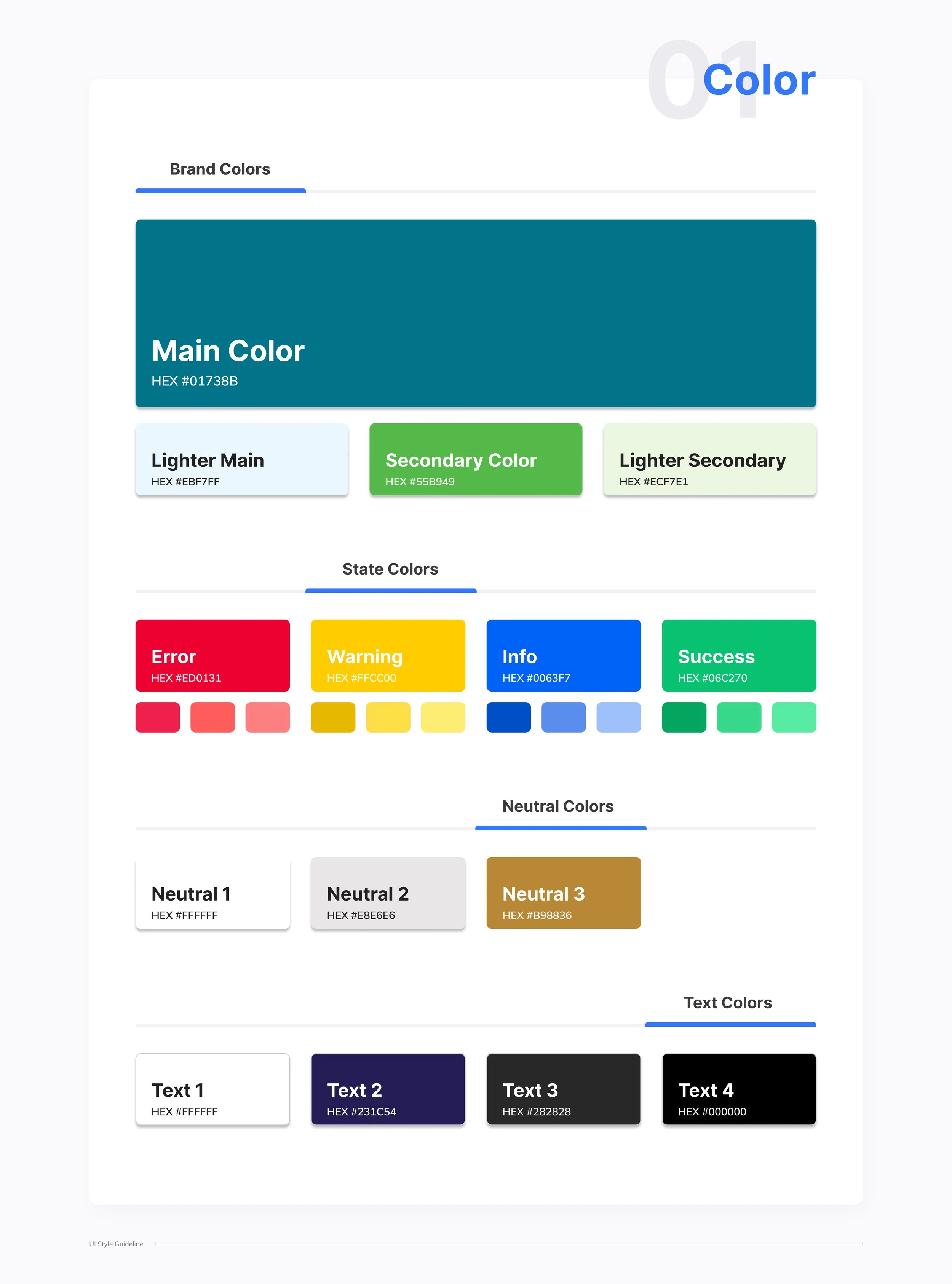


To view the full style guide…
High Fidelity Prototype


Future Steps
In future iterations of this project, I would…
Change header image of waves to a gif/video
Have the accordion pushing bottom of page down and eliminating need for extra space
Add more animation to increase interactivity
Improve the brand identity of the site, digging deeper into color theory and fonts.